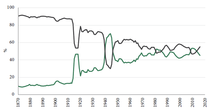
Two charts show how our society has been transformed in the last century or so: the party share of the UK popular vote and UK state spending as a proportion of GDP.
Via Wikipedia, the parties’ vote shares since about 1830:
And via 2020tax.org, an updated chart I have used before: David B Smith’s historic look at the growth of state spending since 1870:

Anyone who thinks this is a crisis of freedom is at best ill-informed. This is a crisis of state intervention.
